
Splash some colour on your walls!
Hi, I'm Glenda
I create art for people who love to add some personality to their space with a bold statement. My paintings are rich with texture and vibrant colour, expressing a mood and abstract sense of place.

Hi, I'm Glenda
I create art for people who love to add some personality to their space with a bold statement. My paintings are rich with texture and vibrant colour, expressing a mood and abstract sense of place.

Hi, I'm Glenda
I create art for people who love to add some personality to their space with a bold statement. My paintings are rich with texture and vibrant colour, expressing a mood and abstract sense of place.
Paintings

There’s nothing quite like an original painting to bring personality and colour to really dress up the walls of your home or office. I have a range of artwork in different sizes to suit all budgets.
Giclee Prints

An affordable option, my giclee prints are printed on a luxurious, velvety paper to really show off all the detail. Approved by the Fine Art Trade Guild.
Greeting Cards

Show them you care with a tasteful art card from my range of carefully curated designs. All cards are blank for your own special greeting, printed on recycled or sustainable cardstock and complete with envelope.
Latest from the blog
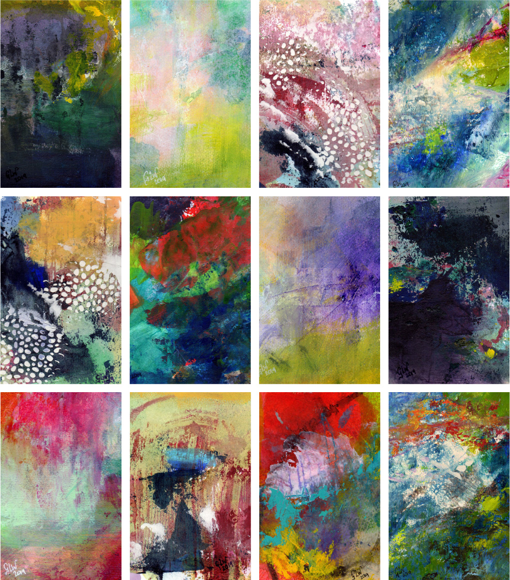
Searching for the Light
“Searching for the Light” is a collection of small abstract paintings from 2019 searching for hope.
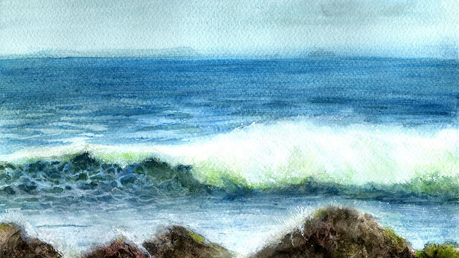
Curling wave
Watercolour again – still find it incredibly challenging, still aiming for a lightness of touch that eludes me.
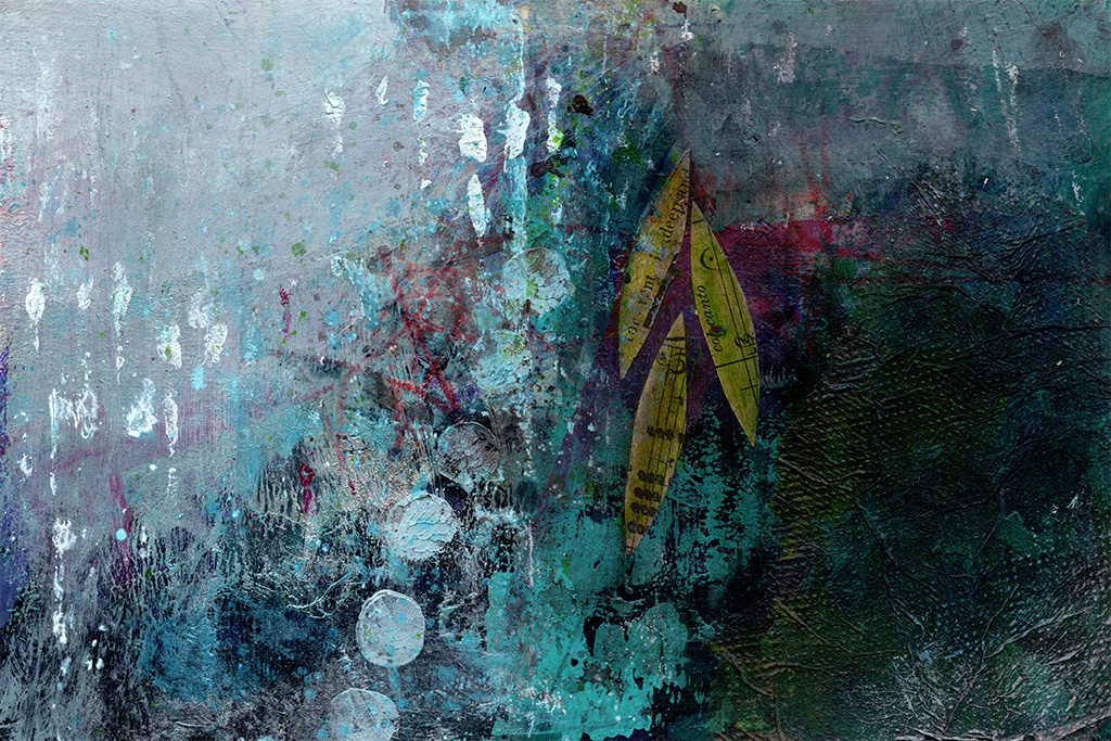
Veil of Tears
My art has always been my self taught form of therapy . It started in my art journals, a place to express in images what I couldn’t always put into words.
Guarantee
No quibbles 30 day money back guarantee on all products
visualiser
Send me a photo of your wall to see how a painting or print will look in your space
tracked shipping
Large paintings are always shipped with tracking and insurance
Safe and secure shopping
I have many years experience running a busy mail order company so you can trust me to look after your order every step of the way.
When I’m not painting, I’m a web and graphic designer so I take protecting your data and privacy very seriously. I use the latest encryption technology to make sure your shopping experience is safe and hassle free.